Since I haven’t visibly done anything for the last week (despite totally re-theming the site, posting assignments for other subjects and fighting off the flu), I’m whacking up a long and rambling post regarding the interfaces of Picasa and iPhoto. Enjoy ![]()
As part of developing my Mobishop concept, I’ve decided to take a look at desktop applications that fulfil the same requirements – focussing mainly on the two leading applications, Apple iPhoto for MacOS X and Google Picasa for Windows and Linux. Hopefully, by looking at these applications, I can get some good insights for Mobishop.
Since I don’t have a Mac at home (gasp!) I’m limited to what is available at the uni, so I’ll be looking at iPhoto 6 (part of iLife ’06). Given Apple’s uncanny ability to totally change software between releases, iPhoto 7 (released a few weeks ago with iLife ’08 [which is a bit early]) is probably quite different.
I’ve broken this post into a few pages to make it a bit more slow-connection friendly, and to break it into more logical sections.
To start, a straight-forward comparison of the Picasa and iPhoto interfaces – pictured below. Both applications are showing a single photo, each offers editing and viewing controls. Picasa additionally shows options to export the photo to blogs/online hosting services.
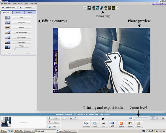
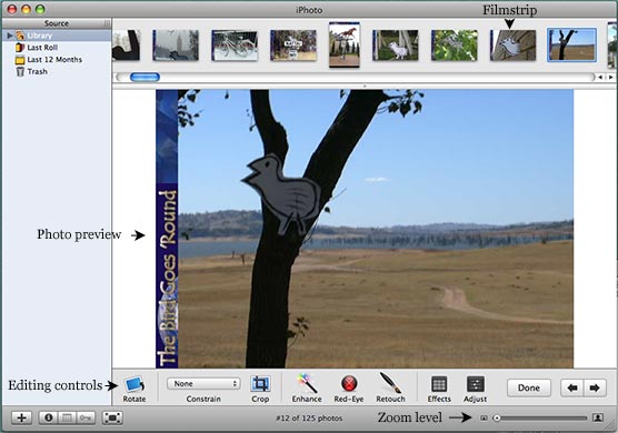
From these images, it’s pretty apparent that each application offers many of the same editing functions. Although, with fairly major differences in implementation. Apple use translucent dialogue boxes for the Enhance, Retouch, Effects and Adjust modes. Whereas Picasa’s sidebar interface is contextual – the sidebar changes to show options for each tool (also with undo options clearly marked).